Color Combinations | A Symphony of Light

We ponder over color combinations while selecting outfits, decorating our homes, admiring artworks, and while observing colors in nature. We may not be designers or artists but are still quite adept at evaluating the harmony of colors. We know when something looks right or if it seems a bit off.
Artists and designers refer to this evaluation as “Color Theory” - a framework used to comprehend which colors work together, what effect they have when mixed together and their overall effect on human emotions.
But the idea is not just aesthetic or a matter of taste and mood. It is neither purely subjective. Science also factors in how colors are discerned. Electromagnetic waves, frequencies and the biological wiring of the human eye all contribute to how colors play together.
Color begins with light

Visible light is just a very small part of the electromagnetic spectrum, most of which is not visible to humans. In the 1600s, Isaac Newton demonstrated that visible light encompasses a range of colors seen within the rainbow, from violet to red.
It’s prudent to think of each of these colors as waves in the ocean. They may be slow, long, gently rolling waves, like those of the color red. And as the colors change towards violet, the waves become increasingly shorter in length, more rapid—like energetic ripples.
The Color Wheel
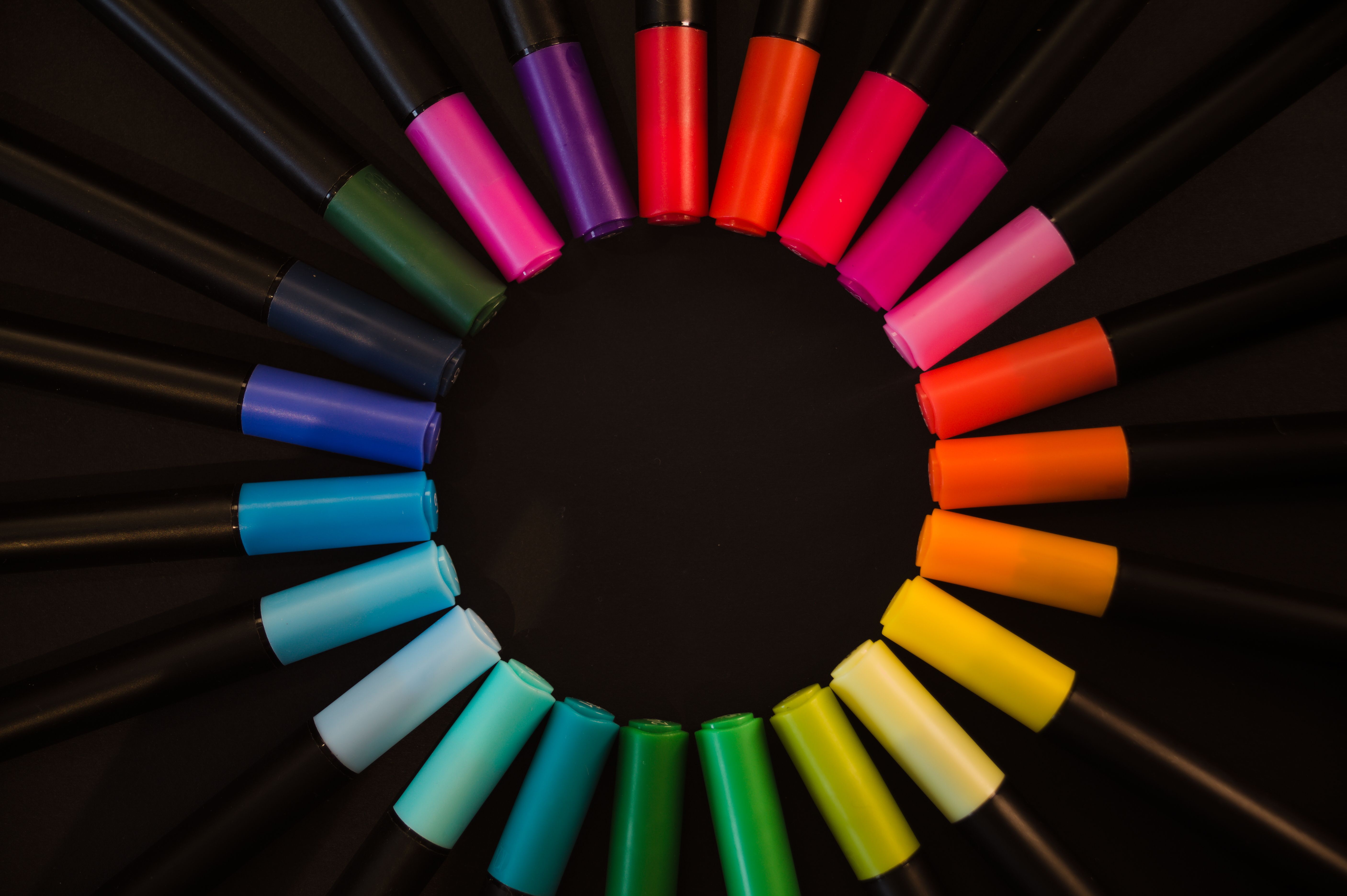
In 1704, Newton placed the linear spectrum of colors in a circle. Eventually, the circle of colors evolved into the Color Wheel we use today—a human-made tool to understand the interactions between hues.
However, it is worth noting that the color wheels, used frequently by artistes today, are not the electromagnetic spectrum where colors are arranged from the shortest to the longest wavelengths. The color wheel, rather, is a means to understand the relationships between colors as we perceive them. Hence on the color wheel, red and violet can sit next to each other even though they are at the opposite ends of the visible spectrum (ROYGBIV or VIBGYOR).
The Bio Processing of Colors

The reason why certain objects appear to be a certain color is because of how that object interacts with light. A tomato appears red because when visible light hits the tomato, it absorbs some of the wavelengths of light and reflects some of the wavelengths. Whatever wavelengths the tomato reflects then strike our eyes. And the bio mechanisms of our eyes interpret these wavelengths as the color red.
Thus, color is not some possession of an object. It is a play between light, its absorption, reflection and our own biology.
Our Eyes Don't Have a Color Detector
The human eye has three broad classes of cells in the retina—the S, M and L cones. These S, M and L cone cells respond to short, medium and long wavelengths, respectively.
But the brain does not look at one particular kind of cell at a time to interpret color. It rather monitors all three kinds together. Comparing all their responses, the brain determines which color is being viewed. This comparative nature of the brain is what plays a key role in determining the harmony of colors.
Complementary Colors | The Interaction of Opposites
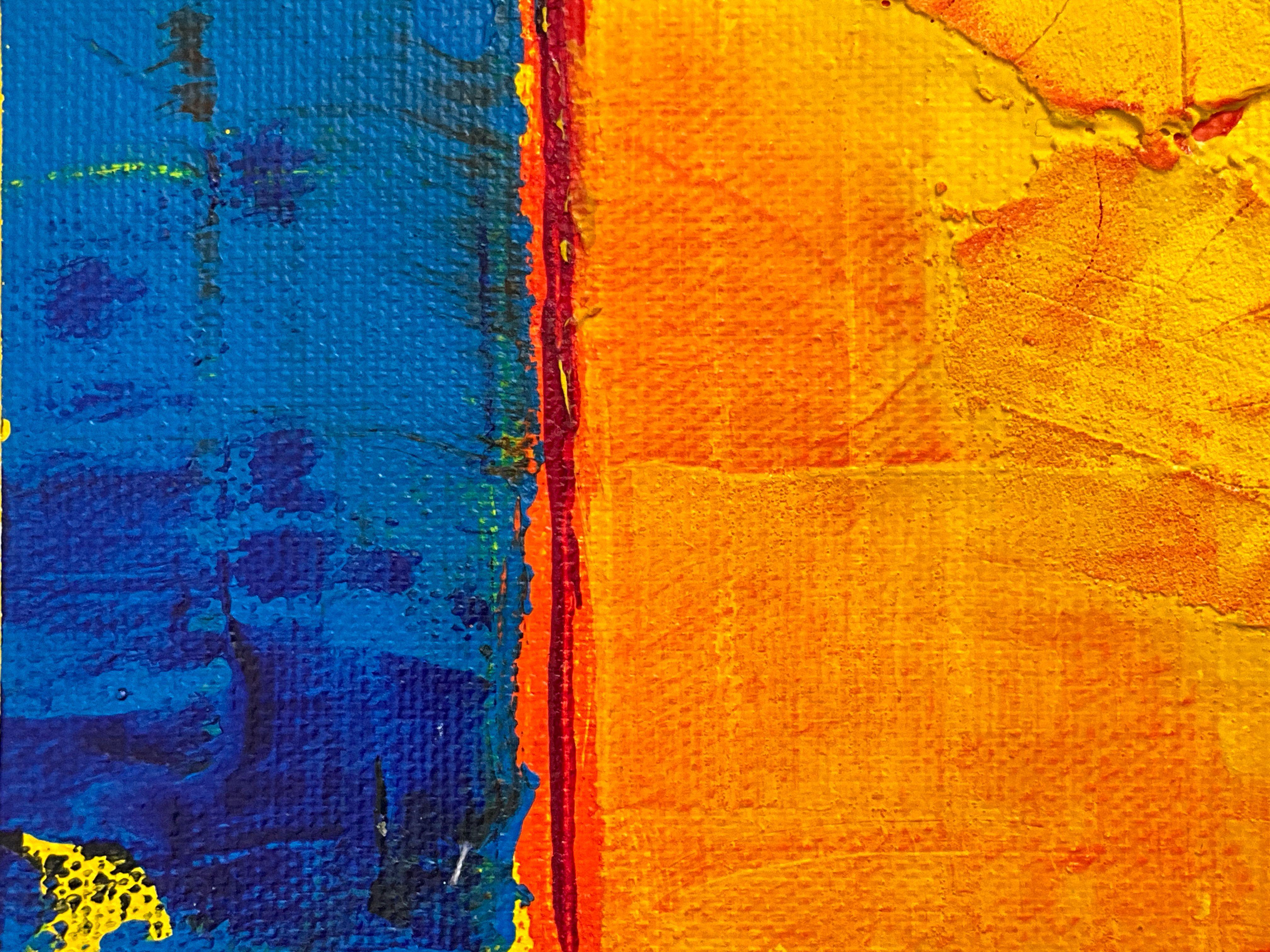
Since the brain compares signals across cone cells, a strong difference between two hues is particularly noticeable to our visual system. In general parlance, this is referred to as “contrast”. The more one color asserts itself, the more the other asserts back. Such a pair of colors is likely to produce a sense of vividness and energy.
Complementary colors take advantage of this. These colors are placed opposite each other on the color wheel. Such pairings include yellow—violet, red—green, orange—blue.
This sharp separation is one of the many motivations of using complementary colors to create visuals that need emphasis—such as posters, logos, notices. The logos of Fanta, FedEx and Taco Bell look striking due to the use of complementary colors, among many other reasons.
Analogous Colors | The Restful Waves

These colors sit closer to each other on the color wheel. And since they appear similar, the differences between them in our visual systems are gentler, less abrupt and not as jarring.
This is partly a reason why analogous palettes—the sage, olive, and moss of a forest, or the coral, salmon, and blush of a summer sky—can feel so instinctively calming. A musical analogy might make it simpler: the visual transition between analogous colors feels more like a steady rhythm than a sudden change.
The result is a timeless trick of perception: resort to sharp separation for creating emphasis, and shift towards soft harmony when you crave quiet cohesion.
Triadic Palettes | The Geometry of Balance

A triadic color scheme uses three colors spaced roughly evenly around a color wheel. Geometrically, a triad forms an equilateral triangle across the color wheel, the colors thus being separated by 120° on the circle. These colors commonly create a sense of balance, energy and harmony at the same time.
Because the three colors are spread across the color wheel, there is contrast. But in a distributed sense, rather than being concentrated between two opposing hues. The three colors of a triad harmonize and create balance because there is no one color dominating the composition. The colors create contrast without overwhelming the eye.
The Caveat to Color Theory | Tendencies, Not Rules
The relationships among analogous, complementary and triadic colors are just “tendencies”. These are not rules. In reality, there are many other factors that play a role in how a color scheme appears. Saturation, brightness, area covered, negative space, context, the lighting in the space, the shadows, the particular colors chosen, cultural associations and many other components—also contribute to how the color scheme is perceived.
The Persistent Existence of Color Theory
Color Theory explains that the perception of a color depends not solely on the color, but also on its surroundings. But for color theory to be a reality, there is no requirement of the knowledge of the kind of cells, the functioning of the brain or even the color wheel. Even without these understandings, our eyes can sense what colors are doing and how our senses are reacting to them.
Long before these scientific findings and artistic rules, generations of people sensed color theory in practice. They felt harmony and contrast, loud and subtle intuitively. For color theory to work it did not need science or even language. Different color combinations existed in nature all around—contrasting and harmonizing.
Look at the trees, the flowers, the animals, the colors in the sky, paintings, the clothes, the pottery, the floors, the walls. There is—and always has been—evidence of color theory all around us.
Disclosure: Some links in this post may lead to curated shopping collections where I may earn a commission if you make a purchase, at no extra cost to you.


Comments
Post a Comment